

Flora Pop
Developing, promoting and advertising Flora Pop probiotic soda brand across multiple mediums and deliverables.
DATE
January 2024 - March 2025
TEAM
Contributor: Myself
Branding
Web Design
Packaging Typography & Layout
Social Media
Environmental
Contributor: Elan Robinson
Branding
Website Illustration
Packaging Illustration & Layout
Social media Illustration
TOOLS
Figma
InDesign
Illustrator
Photoshop
Google Suite
Webflow
DELIVERABLES
Logo & Design System
Website Landing Page
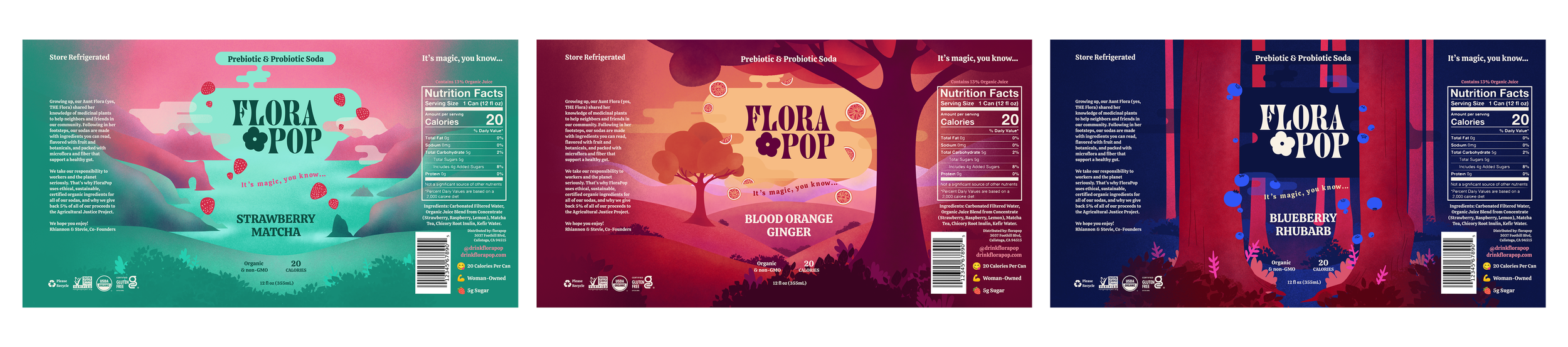
Product Packaging (3 Flavors)
Social Media Proof
Point of Purchase Display
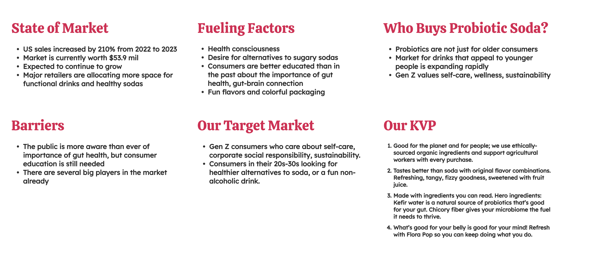
Problem
FloraPop is a new social good probiotic soda brand, presenting itself as an alternative to drinking traditional soda. As it is a new brand entering into an already over saturated industry, they need to attract and maintain a consistent customer base. There is a lot of competition with brands featuring similar offerings, so FloraPop needs to stand out from the crowd.
Background
FloraPop is a fictional probiotic soda brand with a mission to support sustainable agricultural practices and agriculture workers. As the story goes, FloraPop was created by two sisters, Rhiannon and Stevie, who were inspired by their Aunt Flora who used to brew kombucha in her 1970's kitchen for their rural Northern California community. Flora Pop seeks to attract new customers, and encourage long-term brand loyalty.
INSIGHT
FloraPop Soda’s strength is their story. It is a sweet, relatable, story of two sisters who were inspired by a family member to make something to help people. FloraPop has nostalgic roots in 1970’s California, which ended up heavily influencing the brand’s style. The goal was to capitalize on Gen Z and Millenial’s love of nostalgia and businesses who support important environmental and social causes to tell FloraPop’s story across multiple deliverables in a new way.
Web Design
Using the system we had created, we moved on to developing a wireframe for the various sections of the website and wrote copy to tell the brand's story. And after incorporating the packaging design, undergoing a series of iterations and design critiques with stakeholders, we completed the landing page for the FloraPop brand.
Social Media
Using brand assets and photography, we created an Instagram stories series showcasing the launch of a new flavor, and a second introducing viewers to the brand's origin story.
Point of Purchase
As another brand touchpoint, I designed a point of purchase display to further market the rollout of new product. Since the brand's story is key to the marketing strategy, I landed on the concept of bringing customers into the world of FloraPop by creating a point of purchase inspired by 1970's kitchens. The best way to showcase and provide product for customers was by renovating a fridge, decorated in branded elements that tell the brand's story.

RESEARCH
The process of designing the FloraPop brand began with competitor research. Our team gathered images and examples of other probiotic soda brand's landing pages, recorded the language used in their mission and brand stories. We eventually came up with our own list of what was working, and what we wanted to use as inspiration for our own brand.
Design SYstem & Branding
Next came a color and typography study, collaborating in discussion using a moodboard of gathered images and examples of soda and kombucha packaging.
We developed our own design system based off of the inspiration in the previous two stages of work, developing a typographic hierarchy, vector logo design, and color palette. Using these brand guidelines we created our consistent set of icons, illustrative elements, buttons, frames, banners, and cards that would be used throughout all deliverables.
Packaging
Custom packaging was vital for the consistency of the brand's image. We also knew that it was important to actually show the product in marketing materials. Working with my teammate on this portion of the project, I tackled typography and layout of the packaging design. After looking at many examples of probiotic soda can packaging, I knew we needed a simpler approach to typography in order to let the illustration shine.


Editorial Design

UX / UI Design