

The Station
Updating branding for a local, mission-focused coffee shop in Seattle.

DATE
January 2025 - March 2025
ROLES
Logo Design
Typography & Layout
Branding Assets
TOOLS
Figma
InDesign
Illustrator
Photoshop
Google Suite
DELIVERABLES
Ready-To-Print Brand Guidebook
Brand Concept
Brand Attributes
Mission, Vision, Values
Style Guide
Coffee Packaging & Merch
Outdoor Store Branding
Responsive Website
Problem
Though The Station is already a beloved local business with two locations in the heart of South Seattle, they lack consistent branding that fits their mission - focused model. In order to increase customer engagement and long term loyalty, branding elements need to be applied consistently across all media platforms customers connect with.
Background
The Station needed to increase customer engagement and loyalty, and lacked consistent and strategic branding. In order to maintain long term customer relationships and reach new audiences, I developed a comprehensive brand style guide for The Station that was built with great intention to better communicate their mission, values, and offerings to customers.
INSIGHT
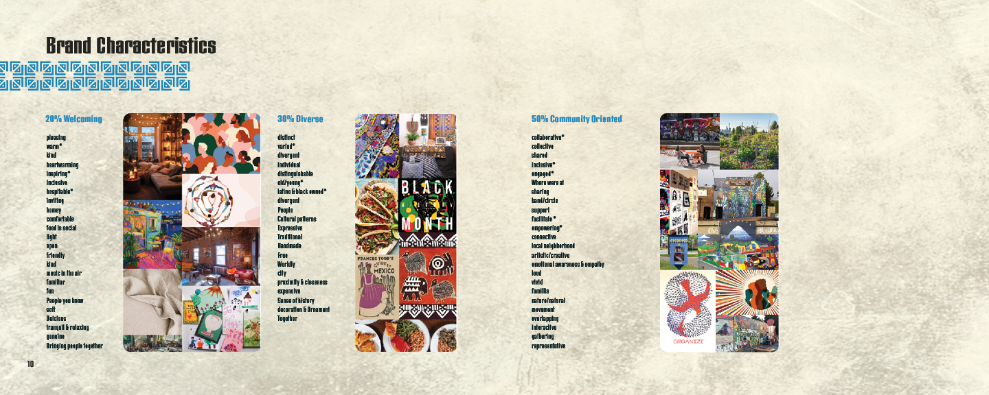
When researching the company and starting to identify brand attributes, it became clear that The Station as a business is extremely mission focused. It’s more than serving coffee. They endeavor to be a beacon in the South Seattle community for organizations to gather, inform, meet, work, and play. Therefore, the design strategy zeroes in on themes like crossings and intersections, beams of light, and cultural representation.

RESEARCH
Designing The Station's branding guide involved researching the company's history to learn about their mission, values, brand promise and assets in order to develop a brand concept statement. Working from that statement, I came up with a visual representation concept board that incorporated color, texture, photography, and typography that fit the description.
Logo & Brand Assets
Next, I worked on creating their logo design, which would help continue to define design choices I would make going forward in the process. I looked at Aztec and Mayan textile patterns as a major source of inspiration.
Inspired by the logo concept, I designed a series of banners and patterns that could be used for multiple deliverables and throughout the brand guide itself. I made final decisions about color palette, photo treatments and typography which helped to define the brand further.

Mockups
After making final decisions about brand elements, I moved forward with designing examples of environmental graphics, a poster ad, possible packaging and merchandise items, and a responsive website.
Brand Guidebook
The last step was to bring everything together in the branding guidebook itself, providing instruction on proper use of brand assets.
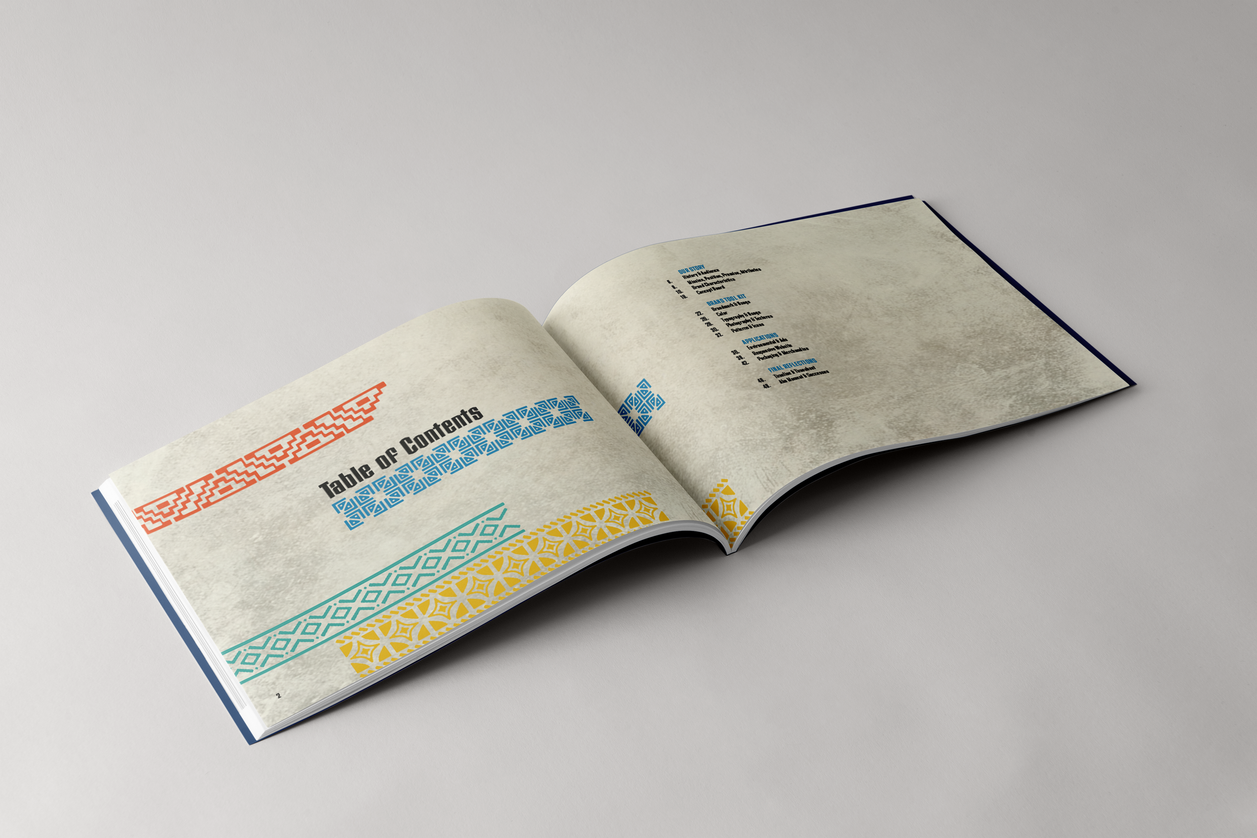
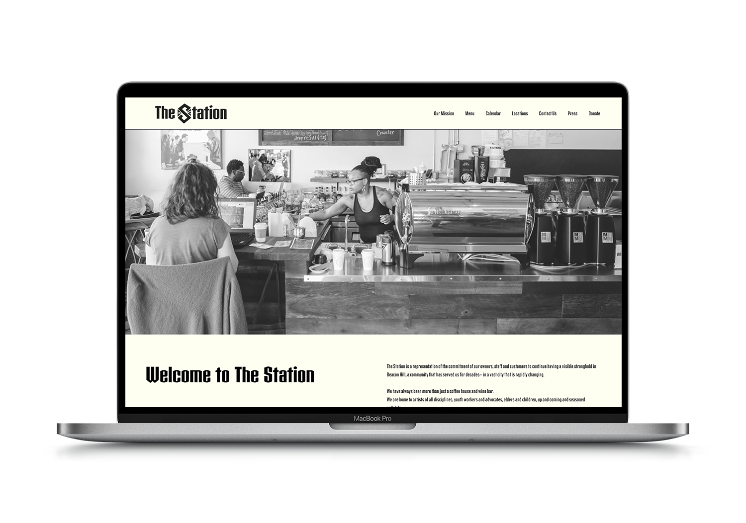


Illustration & Advertising

Game Design, UX / UI, Branding

Editorial Design

UX / UI Design